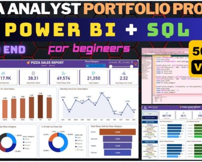
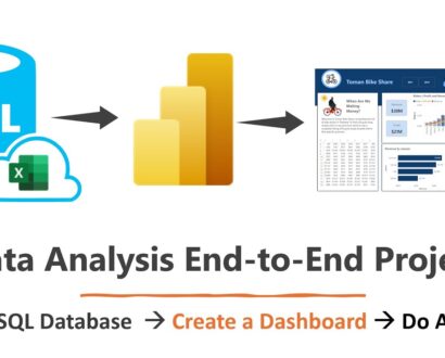
Data Visualization


Data Visualization is a course that focuses on the art and science of representing complex data visually. In this course, students will learn the principles and techniques of effective data visualization, and how to create compelling visualizations that communicate insights and patterns in data. The course starts with an introduction to data visualization, and why it is important for understanding and communicating data. It covers the basic principles of visual perception, and how to design visualizations that are easy to read and understand. Students will learn about different types of charts and graphs, such as bar charts, line charts, scatterplots, and heat maps, and when to use them. The course then dives deeper into the tools and techniques for creating effective visualizations. Students will learn how to use data visualization software, such as Tableau, Excel, and R, to create interactive and dynamic visualizations. They will also learn how to apply best practices for color, typography, and layout to enhance the clarity and readability of their visualizations. The course also covers advanced topics, such as data storytelling, visual analytics, and visual data mining. Students will learn how to tell stories with data, and how to use visualizations to explore and analyze large datasets. Throughout the course, students will work on hands-on projects, where they will create their own visualizations using real-world datasets. They will receive feedback from instructors and peers, and learn how to critique and improve the effectiveness of their visualizations. By the end of the course, students will have a solid understanding of the principles and techniques of effective data visualization, and the skills to create compelling visualizations that communicate insights and patterns in data. They will be able to apply these skills to a wide range of fields, including business, journalism, science, and government. Author: Alexis Cook (Kaggle)